

Elevate Your Captions Styling for Short-Form Success
Discover how to enhance your captions styling with motion graphics for better engagement and readability in short-form videos.
The Importance of Captions Styling
In the fast-paced world of short-form video content, grabbing your audience's attention within seconds is crucial. Captions are not just an accessibility tool; they’re a powerful way to enhance engagement and ensure your message is communicated effectively. With more users watching videos on mute, stylized captions can elevate your content, making it visually appealing and informative.
Why Motion Graphics Matter
Most captioning tools simply overlay text on your video, creating a flat viewing experience. In contrast, motion graphics subtitles add depth and design, making your captions stand out. This is particularly important for short-form platforms like TikTok, Instagram Reels, and YouTube Shorts, where viewers scroll quickly through content.
Classic vs. Composite Mode
Sleepy Motion offers two distinct captioning modes:
- Classic Mode: This mode provides a fully animated treatment of your captions rendered on top of the video. It’s perfect for straightforward projects where the focus is on the text itself.
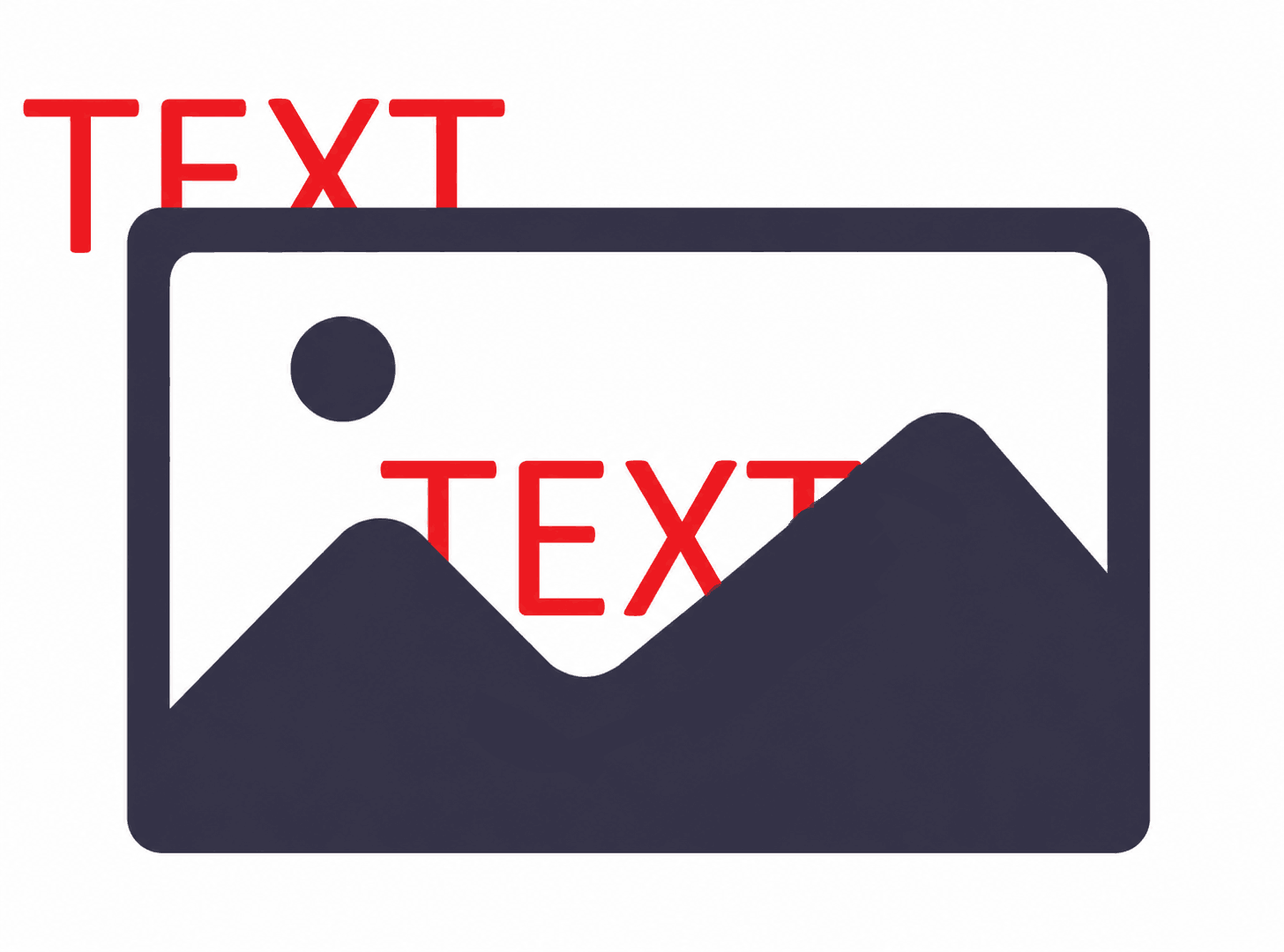
- Composite Mode: Here’s where it gets exciting. The Composite mode automatically masks your subject and renders the graphics behind them, creating that desired “text behind the subject” effect. With no manual rotoscoping required, you simply upload your video, and everything is done for you. This not only saves time but also enhances the visual depth of your captions, making them engaging without overwhelming your main content.
Best Practices for Caption Design on Social Media
When styling captions, keep these best practices in mind:
- Choose Readable Fonts: Opt for sans-serif fonts that are easy to read on small screens. Avoid overly decorative fonts that can hinder readability.
- Use Color Wisely: Ensure high contrast between your text and background. Light text on a dark background (or vice versa) increases legibility.
- Size Matters: Captions should be large enough to read easily without covering essential visual elements.
- Keep It Short: For social media, short and concise captions work best. Aim for no more than 2 lines to maintain viewer engagement.
Style your captions
Describe the look, then drop in your video on the next step.
Examples of Effective Caption Styling in Paid Ads
Stylized captions can significantly enhance paid ad campaigns. For instance:
- Instagram Ads: Use Composite mode to highlight your product while keeping your captions dynamic. The motion graphics will draw the viewer's eye, emphasizing key messages without distracting from the visuals.
- YouTube Ads: Implement Classic mode for straightforward ads that require a focus on narration. However, consider using Composite mode where you want to highlight engagement, like testimonials or product showcases, allowing the text to interact with your visuals.
Troubleshooting Common Caption Styling Issues
While using Sleepy Motion, you might encounter some hurdles.
- Text Overlap: If your captions overlap with crucial visual elements, consider adjusting the text position or changing the text’s size.
- Readability Issues: If your captions aren’t legible, tweak the font color or size. High contrast is key.
- Language Detection Errors: Double-check the auto language detection settings if your subtitles don’t match the spoken language. Ensure you’ve selected the right options in the upload settings.
Motion Graphics Subtitles vs. Plain Captions
Let’s break down the core difference:
- Plain Captions: These are simple text overlays that do not add visual appeal. They often blend into the video, leading to less viewer engagement.
- Motion Graphics Subtitles: These incorporate animations, depth, and design, capturing attention and enhancing the storytelling aspect of your video. They keep your audience watching longer, which is essential for retention on platforms like TikTok or Instagram.
Conclusion
Stylized captions are no longer just an accessory but a necessity in effective video content strategy. By leveraging Sleepy Motion’s Composite mode, you can create captions that not only enhance clarity but also add a visually engaging layer to your videos. Whether you’re a content creator or running paid ads, implementing these caption styling strategies will undoubtedly boost viewer engagement and retention.
Key Takeaways
- Choose readable fonts and ensure high contrast for better visibility.
- Use motion graphics to enhance visual storytelling.
- Keep captions concise and strategically placed.
- Troubleshoot common issues to maintain quality and engagement.
- Always prioritize viewer experience in your caption design.
Elevate your captions styling today, and watch your engagement soar.
Frequently Asked Questions
What are motion graphics subtitles?
Motion graphics subtitles are animated captions that add visual depth, making your text stand out in videos.
How does auto language detection work for subtitles?
Sleepy Motion automatically identifies the spoken language in your video, allowing for accurate subtitle generation.
Can I upload vertical MP4 videos?
Yes, Sleepy Motion supports vertical MP4 uploads up to 150MB.
What is the difference between Classic and Composite modes?
Classic mode overlays text on the video, while Composite mode places text behind the subject, creating depth.
What are some best practices for subtitle readability?
Use high-contrast colors, readable fonts, and keep captions concise to enhance readability.
How can stylized captions boost my engagement?
Stylized captions capture attention and improve viewer retention, crucial for platforms like TikTok and Instagram.
Make it yourself with Sleepy Motion
Describe the look, then drop in your video on the next step.